Friday, January 26, 2007

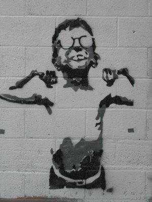
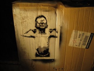
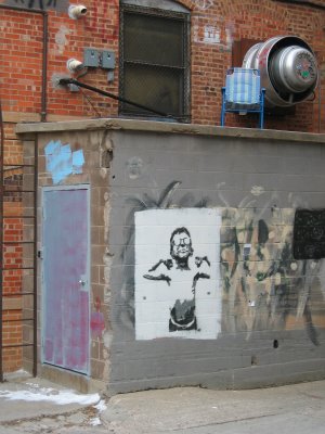
Stencil Art - Rapid City, South Dakota (Detail)


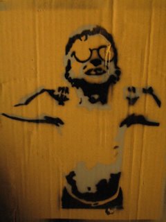
Just thought that I'd toss out a close-up of the stencil fro the Art Alley in Rapid. Not perfect, but not too bad for a -10F middle of the night excursion. I have been doing a little looking around, and although I am pretty stoked with what I have done so far, I am gonna start looking into other images. I am thinking that focusing on just heads, kind of like portraits, might be a fun thing to do... Get really detailed, find a way to work on a bigger scale - we'll see...

Thursday, January 25, 2007

Stencil Art - Rapid City, South Dakota

A couple of images from a city known as "The Star of the West"...
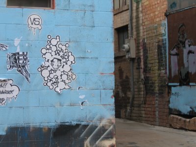
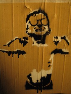
When you walk into this alley, you immediately notice that there seems to be lots of art that has been painted over. It was probably done by the store/building owners, but certain things have been spared this wanton rolling. I wonder if it's some type of Tagger/Stencil Artist turf-war? Regardless, it's too bad to lose the time that was put into those pieces. If you look closely, you can still see quite a bit of work on some of the walls. Artists have taken the painted-over areas as an invitation to start again, and it seems to be kind of a natural process of rejuvination. I've included pics of some of my favourites (I'm sure that you'll recognize the burly kid in glasses).
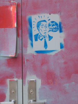

The 'cleaner' obviously agreed with the above stencil, and decided just repaint AROUND it...
This angle shows some of the stuff that has not been painted over. I especially like the pills in the top right - they were everywhere, including the ground (if you look closely), and were really well done.
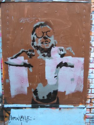

It shows kind of a neat effect on different surfaces.
Friday, November 10, 2006

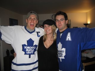
Happy Birthday Kath

Original image, first one that I had to do any cropping. Took those brutal Leafs jerseys out and the picture got quite a bit better... (sorry Jeff and Todd)

Thursday, November 09, 2006

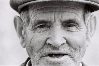
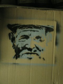
Old man wearing hat

I loved this picture when I first saw it. It is kind of difficult because the shadows and highlights aren't overly contrasty. Its funny looking back at the original image now because it seems like this guy came out pretty grumpy in the stencil, but maybe didn't start out that way. I guess that is what we call artist interpretation... Regardless, he is a pretty crusty looking old guy.

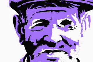
Purple

Another photoshop project. This one is pretty detailed, and was especially difficult because my knife was getting dull. I need to get some more blades, but in the end I really like this guy.

two-tone old man

Just used black and grey on this one, it is pretty simple, but I like the way that the highlight and the grey kind of blend...

purple

The finished product. He is looking the other direction than the first two-tone try, but this is because I flipped the stencil over... It smeared a little, but still looks pretty good.

Tuesday, October 31, 2006

Beginning

Tough Guy

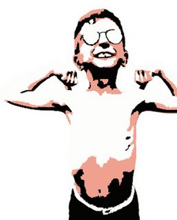
This is the dude that I started with. I think that he looks pretty tough for a little guy with glasses.
Then I broke down his image into three different colors. I didn't really know how to use photoshop, so I screwed around until I figured it out. I still think that using pink would be a cool look...

two-tone grey

two-tone drip

More

Monday, October 30, 2006

Tough Guy